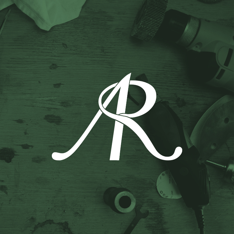
Allrounder Remodeling
This rebranding effort started when I was approached by the client in the spring of 2016. They wanted to update the logo for their remodeling company’s 10-year anniversary. They wanted their logo to look less like a construction company and to give it a higher class look. I started with sketching different concepts and then decided on 3 different directions to move forward with. After a meeting with the client we moved forward with the final concept. It combines the first two letters of the company’s name and combining them to form both letter forms. The R wrapping around the A reflects the company’s start-to-finish process, as they bring peoples dream remodels “full circle”, as well as a tribute to the company’s sustainability practices with the colors. The cursive font not only gives the logo a higher class appeal, it also gives the logo a good rhythm and flow.
Selected Works

Heritage EmbroideryApparel, Marketing & Web Design

Ursa Minor OutfittersBranding & Product Design
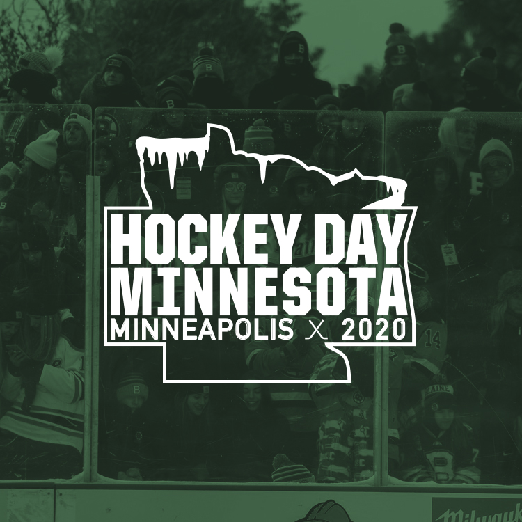
Hockey Day MinnesotaPoster Design
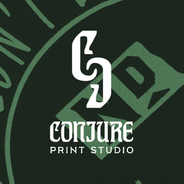
Conjure Print StudioApparel Design

Code Blue EMS CampLogo Design
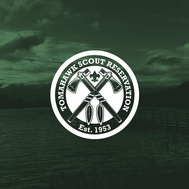
Tomahawk Scout ReservationApparel Design
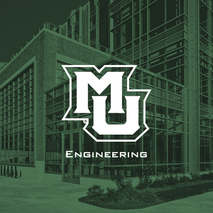
Marquette EngineeringApparel Design

Five O'Clock SyrupsPackaging Design
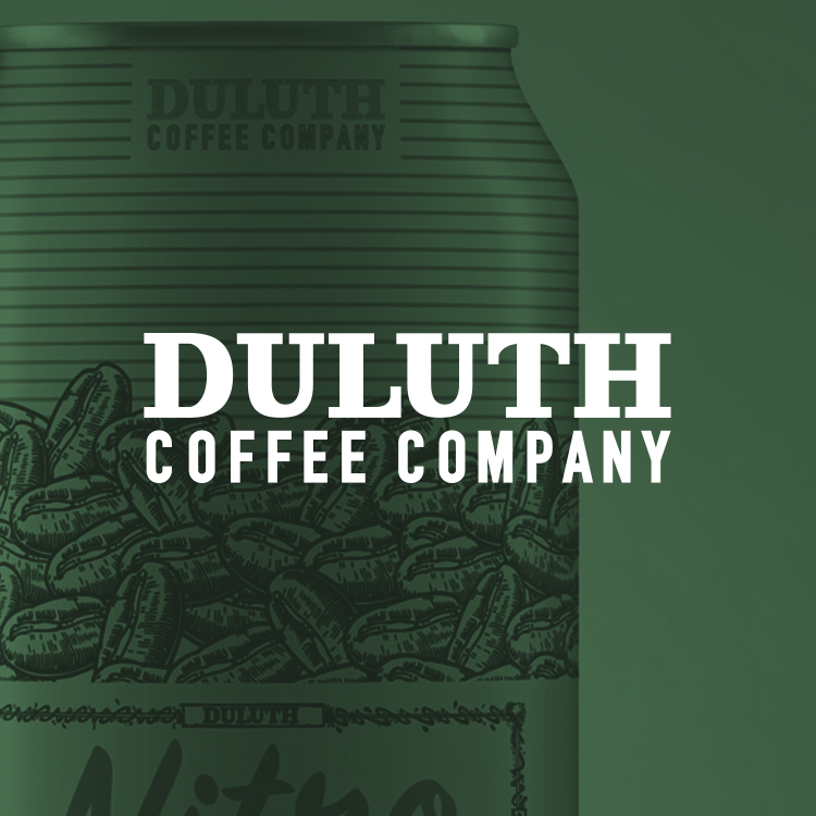
Duluth Coffee CompanyPackaging Design
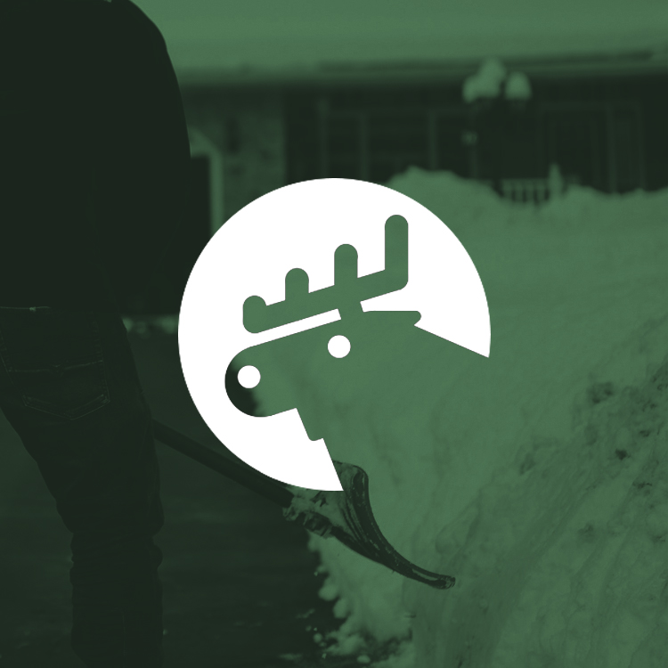
Snow Tracks Weather AppLogo & App Design
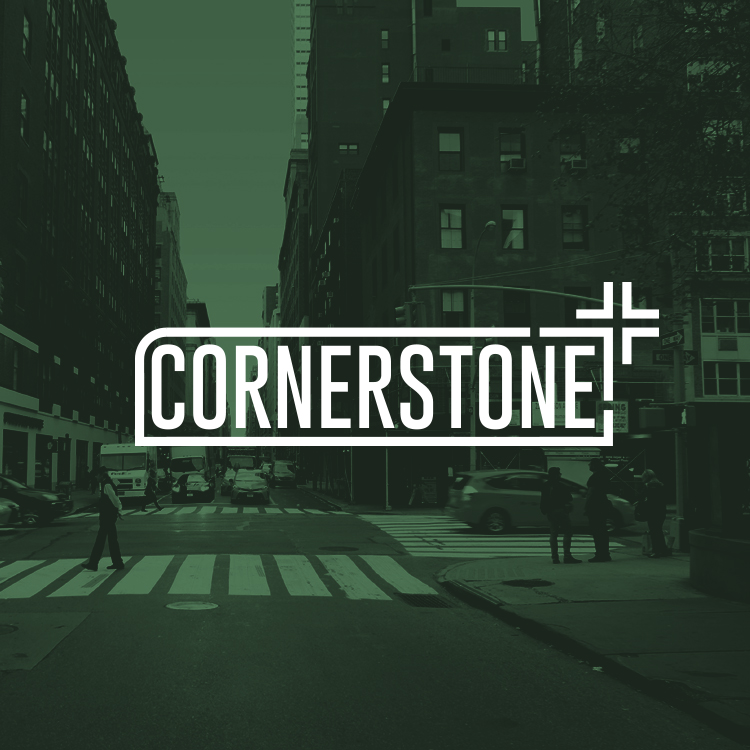
Cornerstone DevelopmentLogo Design
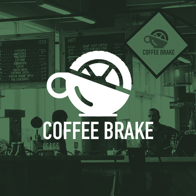
Coffee BrakeLogo & Web Design

LuminateLogo Design

Midwest RallyLogo Design
Allrounder RemodelingLogo Design

Water ZooLogo Design